Today we are looking at something a bit special, with three quite unique pieces.
We have a test shot of the recent Gold version of Masterpiece MP-O5 Megatron.
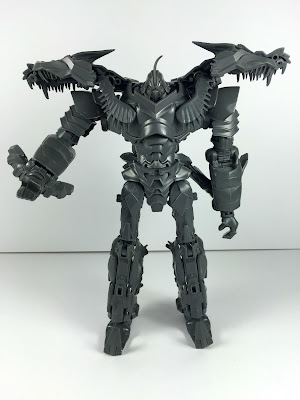
Following that is grey test shot of Age of Extinction Leader class Grimlock.
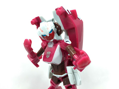
Last up, and probably the pick of the bunch for most people, is a test shot of the deluxe Transformers Animated Arcee figure, which was used for the packaging photography,
So an electic bunch of toys from a wide variety of lines and all are figures I have never handled before. Yay to new experiences!
The story goes that Masterpiece designer Hisashi Yuki designed Masterpiece Megatron in just 12 short days. Less time than it takes to...okay I am drawing a blank on that. Such a rushed schedule clearly lead to many compromises, and so Megatron came to exist as the ugly duckling of the Masterpiece line - despite many quite ingenious engineering tricks
Here we have an unpainted test shot of the recent Gold re-release of the figure, so nothing is different mold wise from the previous releases. However we get to see the figure in its rawest form, as a stark, grey prototype.
Artwork frequently used throughout G1, particularly on his toys box art, depicts Megatron with a Gold chest and there is is also the cartoon episode the Golden Lagoon, which sees Megatron go for a swim in a puddle and emerge encased in Gold and invulnerable. I wonder if these were the inspiration for the otherwise random shiny Gold deco this Megatron's offspring were destined to be covered in.
But maybe, it is just Hasbro Asia being a bit fancy to celebrate the 30th anniversary of Transformers - I suspect that is the case.
Megatron is one of only two Masterpiece molds I have never held before (the other being Rodimus which is rapidly turning into something of holy grail of mine) and handling this didn't make want to run out and change that.
Whilst the test shot can transform into a replica Walther P.38 I did not manage to do so as some of the joints scared me with their tightness and a couple of pieces popped out without me knowing how or why they felt inclined to do so. The legend that is Morg said to go ahead and try anyway, but I did not want to break someone elses toy - which would have been just my luck at the minute.
The rougher edges on the engraved "P.38" give it an almost eerie quality which make this feel like it has not just fallen off a production line.
Using flat, brutal looking Gray plastic makes Megatron look closer to how he appeared in the cartoon, and the colours dress him more like the Microman concept model which Megatron's animation design and colours spring from.
So it feels like the most accurate of the Masterpiece Megatron releases so far, which is quite amusing. The colours are much better on this without the bling gold, or shiny silver.
It feels a bit more subdued, and that works to give him a bit more gravitas as a character toy.
Megatron's proportions have always been this toys downfall, because they are a complete mess. As mentioned before the designer only had two weeks to design this figure, and it is a rare example of a misstep from Takara with them rushing to force a toy out in a ludicrous timescale.
Perhaps it is responsible now for Takara enforcing a much longer production time on its Masterpieces, and why they are often delayed (like Tracks is right now).
This figure though is...aesthetically challenged. The head looks massive on that body, the face shrinks into a giant helmet which is too squared off for its own good. The head and chest look enormous in comparison to the spindly arms and legs which themselves look really long.
All of the details are there, but it is like it has gone through a fun house mirror filter first to make it look like it does.
Adding his fusion cannon to his arm only serves to compound the problem as it looks comically over sized.
The test shot comes with some of the accessories the final toy did, but in different colours. Instead of a bright Purple translucent plastic or yellow for Kremzeek, they are all produced in clear plastic for this prototype phase.
Lacking colour, it is a bit tougher to discern the details on these pieces, especially Kremzeek's facial expression because they just blend in but they do look a bit nicer. I adore the shade of light shade of Purple used on the flails chain, which did make it through to the production figures.
His little pistol that he uses to shoot Optimus Prime to death in Transformers the Movie is also present, and it is easily the best choice of weapon for him as it is the only one that does not look a bit awkward.
As a test shot, I find myself liking this far more than any other iteration of Masterpiece Megatron. The toning down of all of the colours makes it look far more like Megatron and pulls him back from otherwise looking a little gaudy as the retail and Gold versions ended up.
I may not like Masterpiece Megatron, but this version easily appeals to me the most and feels closer to the source material than any of the actual released products did. What the designer did in just two weeks is actually quite incredible, but then balanced against it being an actual released figure...it needed far more time and refinement.
Tight joints may have prevented me from transforming it, but as a new experience it was both fun and frightening. When things pop off and you don't know why, it is the toy equivalent of something going bump in the night. You know something is wrong, but you have no idea where or what the source of it is and you start to panic.
Generation 1 Megatron is a strange looking robot, which zany proportions and a crotch that would make Ron Jeremey blush, so it makes sense that his Masterpiece toy suffers a similar fate. Strange proportions are G1 accurate, even though where that toy was squat and strange, this one goes completely the other way by being lanky and spindly.
To this day we are still awaiting the perfect G1 Megatron, No one seems to be able to get it quite right which may be purely down to the struggle of trying to convert an animation model from 30 years ago into a three dimensional model that can then fold in upon itself and turn into a realistically sized hand gun. If you thought it was tough idea to swallow in fiction, it has proven immeasurably tougher for toy makers in real life.
Anyone who reads my blog regularly (and if you aren't you should be - feed my ego) will know that I do not like the live action movies (except the first one) and the toys even less so.
My eyes see them as a mess, and my brain agrees and chastises me every time I force them to watch one of the movies.
So of all the things that were in the box of delights that Morgan kindly sent me to look at, I am stunned that this was my favourite and caused me to consider actually handing over money for some movie figures, in the form of those Platinum Dinobots that are coming along soon (yes, I know the Grimlock is a different mold but it's a much more palatable first step).
Michael Bay famously said that he didn't like the Dinobots, in fact he said he hated them, so with that man's record of daft statements it was inevitable they would one day show up. Sure, show no respect for things your audience like, it's cool man.
Why do we keep putting money in this mans pocket?
No, this is not a Black repaint, what you are looking at is a test shot of Age of Extinction Leader Class Grimlock. Completely unpainted, it is produced in a lovely to the touch feeling dark grey plastic. It does not feel soft, but it does not feel the same as Hasbro production plastic.
When designing Grimlock for the movie, the designers opted to bolt on the Knight of Cybertron stuff from the comics, and gave each of the designers a warrior style appearance.
They seemed to take the actual concepts of ye olde Knights and fashion it into something that could turn into robotic Dinosaurs. This is actually a really cool idea, and here he comes across as possibly an undead shadow barbarian.
So if you look at the figure, you can pick details that are clearly there to evoke a savage looking suit of armour. There's lots of detail to be found, and there are also a lot of gaps and holes- but they are more a result of the design aesthetic than Hasbro's cost cutting.
Grimlock comes with a rib cage on a stick (a mace?) and an arm mountable bone saw that has a toothbrush on the top.
I kid, I kid, I believe it is supposed to be a shield but it has too many gaps to be effective as that, and it is also covered in spikes which suggests instead of a defensive weapon - Grimlock uses this to hurt people.
But then everything is covered in spikes.
I mean look at those spiky shoes - is he a demonic Aladdin?
People evidently go for this sort of thing, otherwise the movies would not be as obscenely successful as they have been and Bay's at least pulled back a little from the hyper detail and mass of parts that plagued the first 3 movies and made it really difficult to focus on the actual robots. There's no bits just hanging off, nor does the robot look animal like - he has a fairly spot on humanoid figure which is all I want Mike.
Grimlock feels toned down in that sense, and it makes a massive difference. I didn't care for his colour scheme as it was painted on to the actual mass released figure, but here the dark Grey helps to smooth over the detailing and makes it feel more focused.
For a test shot, all of the joints are really nice and tight, and he has a nice balanced weight. He is really fun to pose with clickey ratchets, and articulation that lets you get some really good poses out of him.
I am a huge fan of the blocky G1 Dinobot's - so it stands to reason that Bay gave us a horny Skeletal nightmare T-Rex.
Yes, apparently it is a T-Rex, but with horns. Even though the odds are impossibly stacked against it, I quite like it. It is big, weighty and it was not tough to transform at all, bar some weirdness with rotating things multiple times, in multiple places to create the stomach. There was some rubbery stuff around the robots neck that I had no idea where that was supposed to do, so hopefully it went...somewhere....during the transformation.
He is definitely Skeletal, but looks seriously mean and definitely metal \m/
I could happily just have him in this mode for life, and I imagine like me you are hearing the roar of the Jurassic Park T-Rex now. That sound makes me like this more, even though it is not coming from it...
Whilst the joints have all been great so far, the test shots Dino feet are a little loose so he tends to rock forward and took some delicate balancing to prevent a face plant.
Fortunately, the joint is just a screw, so tightening that should completely solve the problem if needs be..
I think being a test shot, the lack of colour works for it, because it automatically tones down the details, gaps and all of that stuff. It makes it look like a more cohesive mass of spikes and parts.
As I mentioned at the start, I scoffed at the idea of a movie toy originally but as I handled it I grew to really quite like it as a toy or more specifically as a test shot. Everything feels solid and the plastic is lovely and fun to handle.
Now I am going to be shelling out money for the upcoming Platinum release in G1 Dinobot colours and with new G1 style heads.
Who am I? I don't know anymore.
Animated Arcee is a figure I have always wanted to own, even though Transformers Animated did nothing for me as a toy line or a show.
This was the first Arcee figure that was specifically homaging the Generation One character who up to that point had never gotten her own toy. Collectors were picking up this figure to fill that void on their shelves, even more than for it being an Animated toy, and so it became quite valuable - even more so as one of the last Animated toys which saw a more limited release, plus it was shifted to being a Toys R Us exclusive.
I did not just want it because it was a great looking G1 Arcee toy, noooooo, it just looked like a fantastic toy to play with in a line of toys that had not grabbed me.
So what is this then? Well Morg reliably informs me it is a coloured test shot that was used for toy photography by Takara (TFW2005's coverage of the unveiling and the complaints about the colour can be read here).
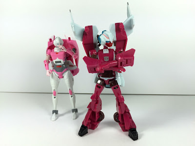
Cool, so why should that mean anything? Ha, many figures are still undergoing their final colour layouts at this point so you often see minor or major changes to the final product. Toys very often vary from their packaging - just take a look at G1 Bluestreak's stock photography for an early example. Animated Arcee's stock photos show her in a sparkly pink colour and with a different spoiler design.
Whilst there is nothing quite as egregious here, there are a handful of subtle differences that make this unique and probably quite desirable amongst collectors.
Arcee's face on this test shot is painted in red, and stands out strongly. During the manufacturing process, this was switched out for a much pleasanter pink.
Her abdomen, upper arms, wheels and upper thighs are painted in brown, but when the figure was released black had replaced it on the US version while Takara's still had brown forearms and abdomen but the other parts were switched to black, apart from her feet which Takara changed to pink.
I am not sure why they used brown on the test shot, as the animation model featured black.
A retro feeling shines through with the brown though, because I can't look at it without thinking of Chromedome, and brown is a very 80's colour anyway. Oddly G1 Arcee was planned for release as a Headmaster, who would have been a repainted Chromedome with a new head.
I am only going by pictures, but I think the pink plastic on this test shot is a few shades darker than the final release which seems to be much lighter.
I could not tell you if the test shot has tighter or looser joints compared to the released figure, as I have never handled one, but this is a very fun to pose but sturdy bot. Animated's aesthetic never appealed to me, but with Arcee it seems to click.
Arcee has a very playful feel to her, the sculpt is rendered in such a way that lends itself to all sorts of fun posing. She can pull off super ninja warrior poses, stroppy teenager poses and all sorts of others. The darker, muddier colour tones on this test shot make her feel a little edgier and angrier than the more perkier looking toy that made it to stores. Using red on the face suggests anger and rage, whereas the pink of the final products already young looking face makes her seem more playful. Oddly the stripes on the head are still pink.
Star Wars informed Floro Dery's designs for Transformers the Movie (as if the movie was not already borrowing heavily from Lucas's films), and Arcee's head is inspired by Princess Leia's bagel style hair do. Perhaps that's where the inspiration for the laser swords comes from?
I could have tried to transform it, and it would have probably been fine, but the way her hands peg in to create the alt mode I didn't want to take that kind of risk. Not only is it someone else's toy, but it is such a unique piece of history that I would prefer it be preserved rather than die at my hands.
Pictures of Arcee's alt mode are available online, so for now I will continue to gaze longingly at the them, whilst telling myself I can't really justify eBay prices.
So there we have it, we travelled through three 3 different Transformers lines, taking a look at some test shots, each has its own tale, and it was fun to learn where each piece fit into its line respective history. I don't collect curios like this, lord knows my wallet could not handle it, but it is nice to experience them and get a peek at how products evolve through the production process.
Thanks to Masterforce for providing me with the opportunity to inspect them.
Please like the Toybox Soapbox page on Facebook where you can get updates and the like here
You can also follow me on Twitter @ToyboxSoapbox


